Devlog #2: The Waterfall Shader
Hey all,
Get ready for some Temple Door Tech™!
In June, we showed the world our waterfall shader and the Twitter post popped off.
Since the response was so good, I thought y’all might be interested to know how we made this particular visual.
Before I break it down, I want to send a huge shoutout to Simon Schreibt for laying the framework out in his blog posts and videos. His resources were invaluable in creating this effect.
I’m not a galaxy brain-lord so I don’t write my own shaders with code. Instead, I use the Unity asset Amplify Shader Editor. It’s a node based shader editor and makes all of this creation super easy. Essentially, the whole waterfall is comprised of 3 different effects:
First you have the ripple of the water below.
Then the splashy foam commonly found at the base of a waterfall.
And finally, the big boi himself, the main waterfall shader.
The Ripple
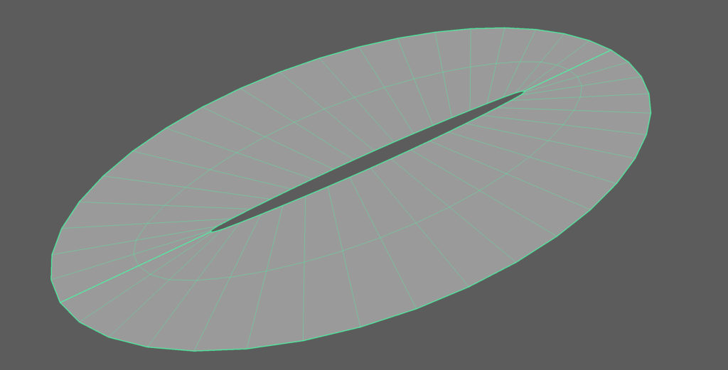
The ripple is essentially a ring of polys that have their UV map stretched out to be a square. I did it this way in order to be able to tile a texture over it and have it blend seamlessly throughout the ring.
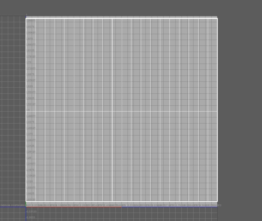
After that, I used a technique that is done a bunch throughout the rest of the shaders in the waterfall. All of the elements in this effect need to be animated right? We gotta get that water flowin’! To achieve this I used the panner node extensively.
Here’s a glimpse of the entire graph:
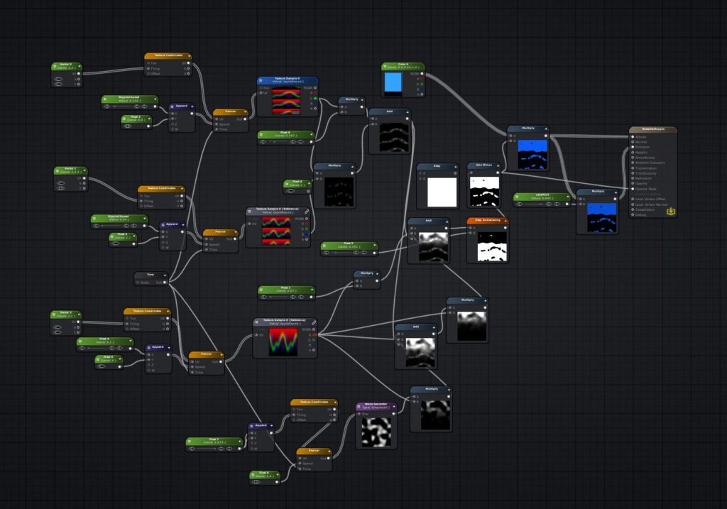
If you look closely, you’ll notice repetition and realize that the graph is basically the same setup three different times over.
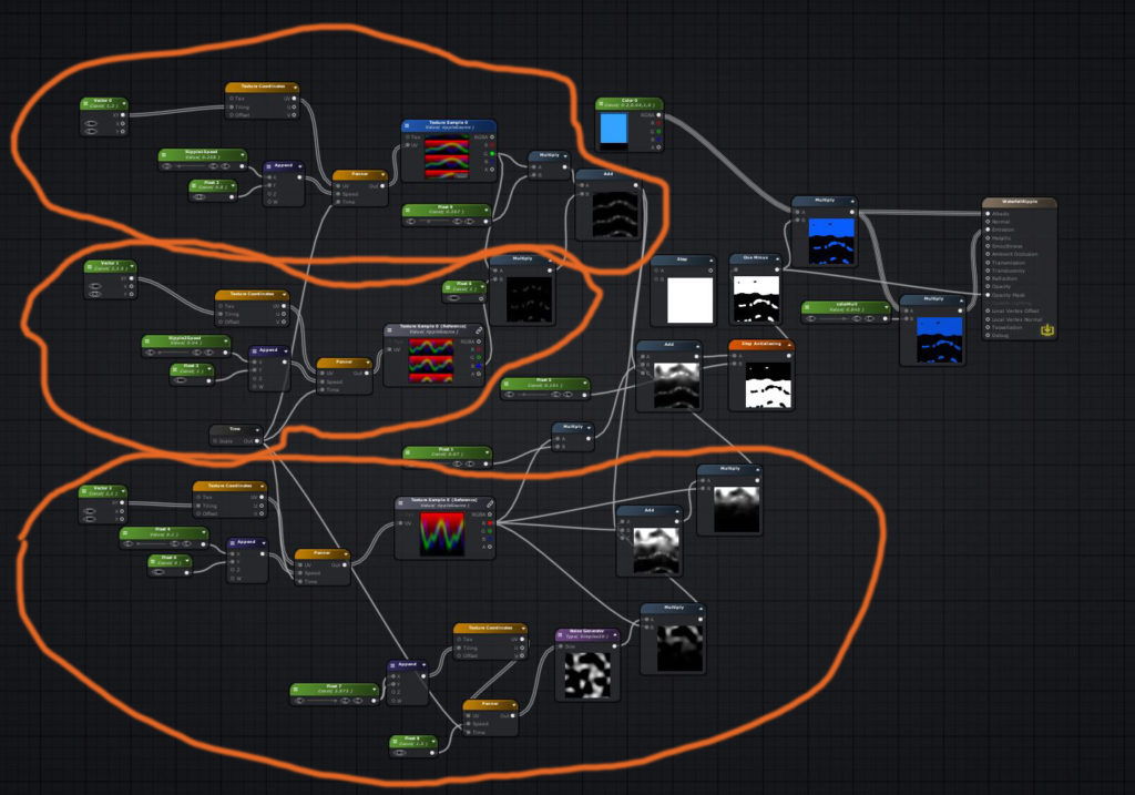
Each time, I used the panner node and adjusted the amount of tiling and speed to create interest and variance in how the ripple itself moves. Notice that all of these plug into the same texture sample seen here:
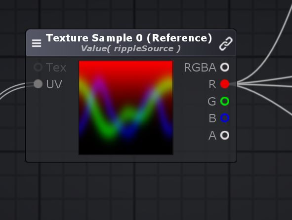
By separating out each RGB channel, I basically got 3 different textures, while only using one texture to save space. Since the 3 main branches are using different speed and tiling values and only affect one color channel, I multiplied these together to get a nice gradient falloff representing the ripple.
Once I had the gradient falloff, I used the step node, which converts anything into 0 or 1 depending on a predefined variable. This creates a clean, stylized ripple that can be multiplied with your desired color and then plugged into emission, albedo, and the opacity mask to make all black pixels transparent. In order to access the opacity mask, the shader had to be on Opaque Render Type and Alpha Test Render Queue.
The Splash Effect
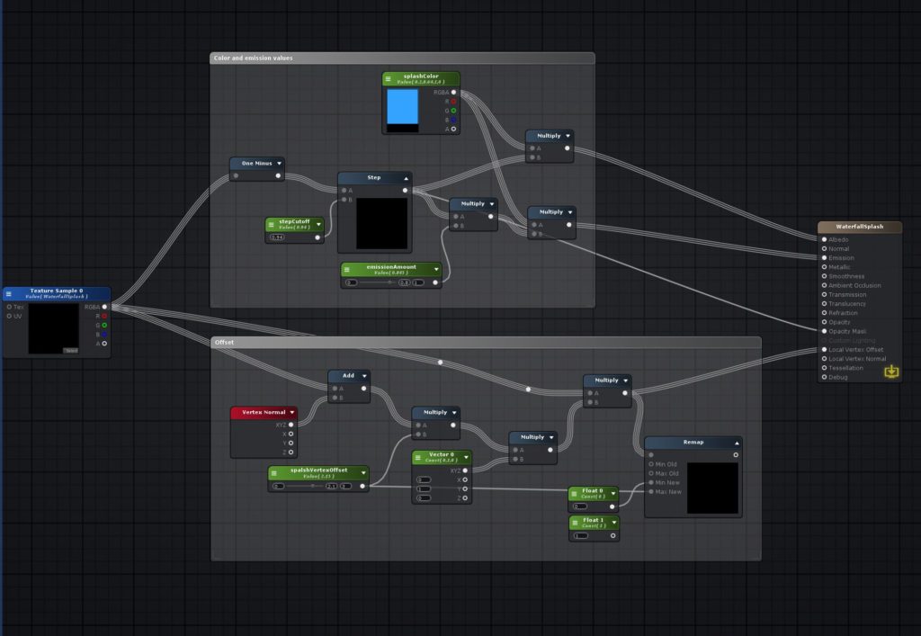
This one is actually surprisingly simple! I created this by making a particle system that is fed into a render texture.
I then plugged that render texture into a vertex displacement and applied a similar Step node setup to what was used in the ripple to plug into albedo, emission, and opacity mask. One thing to note is that I multiplied the vertex offset by a 0,1,0 vector to make sure that all offset only goes straight up.
And onto the main effect for the waterfall…
The ACTUAL Waterfall!
Before you flip out, I’m just going to say that a lot of these nodes are similar to the setup in the ripple shader to create different sorts of movement, so try not to get overwhelmed!
Without further ado…
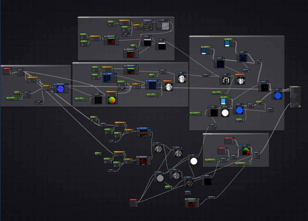
I know… It’s a little bit of a mess. But most of this is just that same setup in the ripple of having different panners with different tiling and speed values. However, there are some key details included that change this.

In order to get the “wavy” appearance seen in the blue and dark blue water in the waterfall, I used a tiling normal map that is a little bit jagged looking. These values are plugged into the UV offset that is applied to the Texture Sample of the water. Normally, the Texture Sample would just scroll in one direction or another. But by doing this, I was able to achieve more interest in the water and basically convert the vertical lines into the more water-like ones seen in the final product.
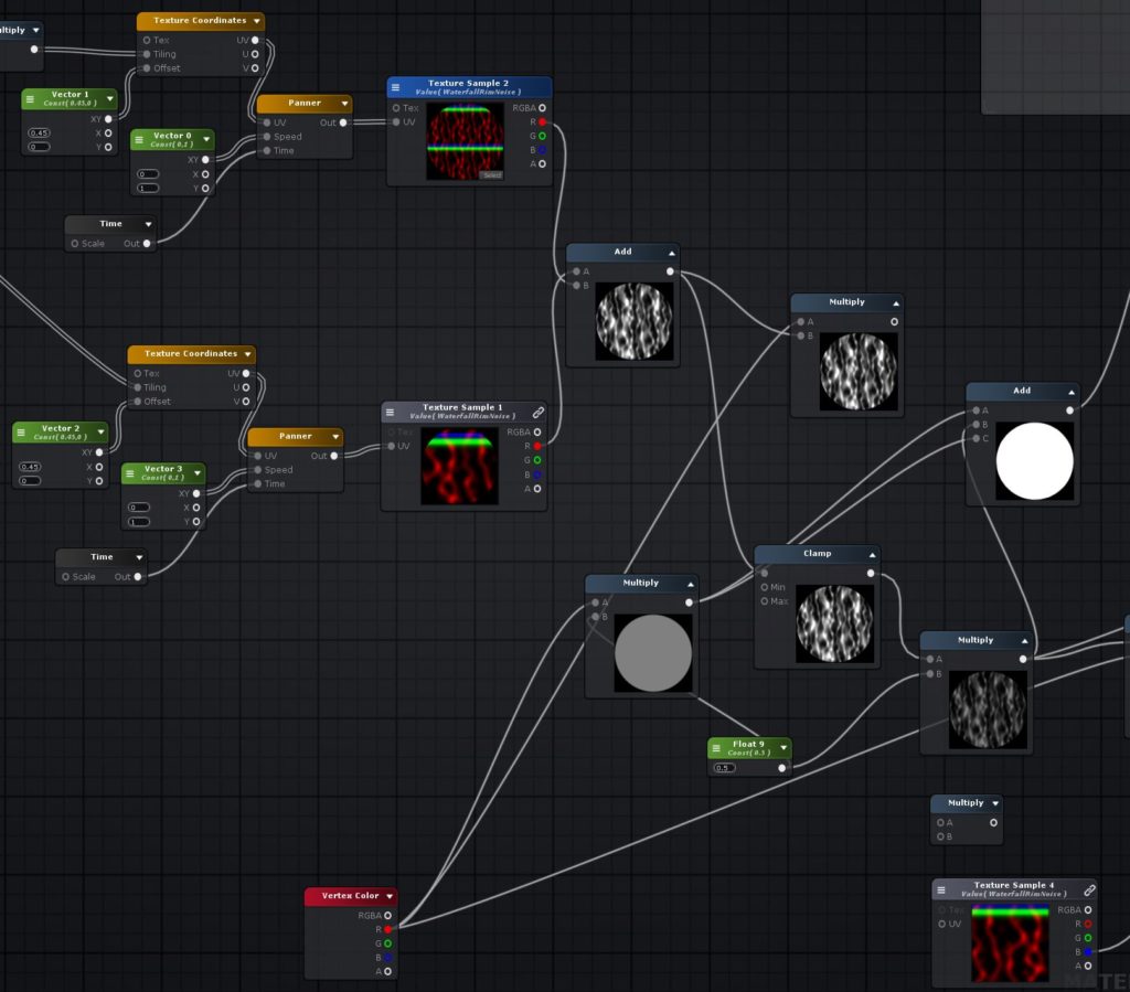
In the bottom half of the graph are all of the nodes handling the white foam on the sides. If you look closely you’ll notice that there is a vertex color node set in the bottom of the graph. I used this so that this waterfall could have a rock in the middle of it. In that case, I would just color the red channel of the vertex colors close to the rock. Since I would be multiplying that with the other texture at the end and plugging into the step node, this color gets applied to only vertices with Red values. Thus, I was able to control where the white foam is placed.
In addition to getting this white foam color, I thought it would be nice to add some displacement to the surface to give a more natural look. This part of the graph controls that:
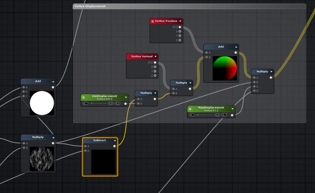
I took the multiplied white foam texture and multiplied it with the vertex normal before adding it to the vertex position. This is then plugged directly into the vertex offset. As simple as that!
Another detail is this top rim of water to differentiate the river from the waterfall:
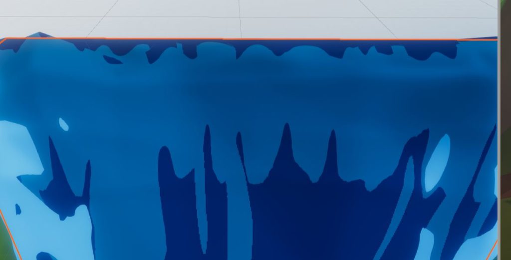
I did this through a method of tiling similar to the other shaders I’ve gone over, but I limited it by painting a gradient on the Green channel in Photoshop. You can see how that node network looks here:
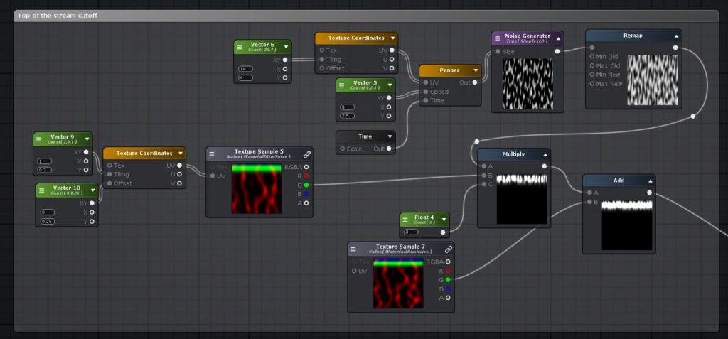
I also added some procedural noise in the top right part of this image to give the rim an undulating look.
And finally, I multiplied all of these different multiplied textures together and plugged them into the albedo and emission maps similar to what I did in the Ripple Shader:
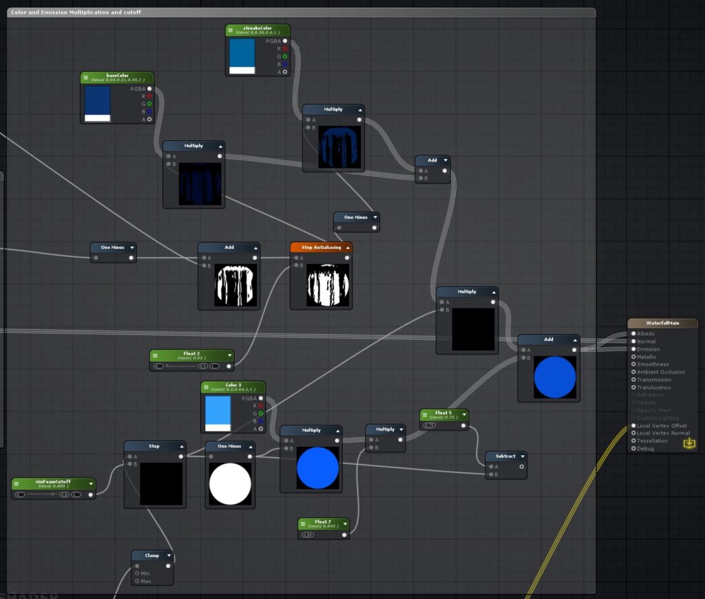
The difference is that I didn’t use an opacity mask here because the waterfall is completely opaque. I added the white noise in last so that the white foam appeared on top of the other colors. In order to get the two tones of the water (dark blue and light blue), I used the one minus node on the texture and then applied the respective colors to the normal version of the texture, and the inverted version. I then added those together to get the desired effect and… boom! A finished waterfall!
If anyone makes something inspired by this feel free to show us how it goes for you!
-Mike
